 , as shown on the sub-form/expandable form below.
Use the Forms Designer to create advanced forms and publish them to the device. You can customize a form layout based on the workflow of the tracking users.
Capture a wide variety of data in the field using custom drop-down lists, selection boxes, text, numerical and currency fields as well as picture fields to capture images or signatures. You can include dynamic fields and repeatable forms that display based on choices made on the device.
The Forms Designer displays the layout of the form as it is created. Form component types are color-coded - the main form top border is blue, sub-forms and expandable forms are ivory, and repeatable forms are green. Additionally, workflow conditional expressions are indicated on the form by the decision icon , as shown on the sub-form/expandable form below.
Main Form 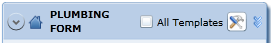
Sub-form/Expandable Form 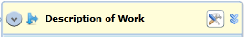
Repeatable Form 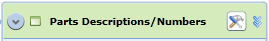
Data is displayed in the application and can be printed and exported. Additionally, the form will display a 'Published' status at the bottom of the screen if it has been published.
 By default, the form design area is displayed at full size (100%). As you create forms with many fields and sub-forms, you may want to adjust the display size to view more of the components. Drag the view slider at the bottom right to adjust the resolution of the form display area.
Use the menu icons across the top of the Forms Designer screen to work with the form:
|
Save |
|
Save to server, or local file |
Refresh |
|
Refresh form |
|
Browse |
|
Load form data from local file |
Application |
|
Close form and return to forms list |
|
Back |
|
Undo last action |
|
Lock form (enter/confirm password) |
|
|
Forward |
|
Redo last action |
Set Auto Focus |
|
Click a form section and then Set Auto Focus to see the relationship between that section and the main form |
|
Collapse |
|
Collapse form |
|
Preview how form will display on device |
|
|
Expand |
|
View entire form |
|
|
|
|
|
Display other advanced form actions |
|
|
Set new fields as template fields |
|
|
Minimize or maximize form |
|
|
Indicates whether field type is Required (*), Template (T), Alpha (A), Numeric (#), Space-enabled (_) or Currency-enabled ($) |
|
|
Remove current field |
|
|
Add a new field directly after current field |
|
|
Click Field Properties to set field types and restraints |
|
|
Hover over and click these buttons on the side of the subform to create a decision or conditional section |
|
|
Copy the field entries listing to clipboard |
|
|
Paste clipboard contents as a listing of field entries in the form |
|
|
Sort fields in ascending or descending alphabetical order |
|
|
Clear all fields |
When you select the Field Properties icon, the following properties are available, depending on the field type you choose:
|
Property |
Description |
|
Text Box |
Allows users to enter text into the field. You can set field constraints, make the field required or mark the field as a template field. If you want, enter a default value for the field in the outlined field box. The user can modify the field as desired. |
|
Information |
Text field that provides static information to user. Users cannot enter data in the field. Use information fields to help define form sections or provide instructions or descriptions. To enter the information that is displayed in the mComet form, click on <Enter Caption here> and type the desired text. |
|
Numeric |
Allows users to enter numeric data in a field. You can make the field required or mark the field as a template field. Specify the number of places allowed in the field before or after the decimal point, if applicable. If you want, enter a default value for the field in the outlined field box. The user can modify the field as desired. |
|
Currency |
Allows users to enter currency data in the field. You can make the field required or mark the field as a template field. For currency fields, select the desired currency sign and specify the number of characters allowed in the field before the decimal point. Currency fields automatically allow two numbers following the decimal point. If you want, enter a default value for the field in the outlined field box. The user can modify the field as desired. |
|
Repeatable Form |
Allows users to create multiple forms associated with a particular field. For example, you can create a repeatable form that allows users to enter multiple part numbers. When you select the field, a separate repeatable form displays that allows you to customize the data allowed in the repeatable form. See Repeatable Forms for more information. |
|
Expandable Form |
Allows users to access an additional form where data associated with the field can be entered. When you select the expandable form field type, a separate sub-form is displayed. The form allows you to customize the data fields contained in the expanded form. See Expandable Forms for more information. |
|
Radio Buttons |
Create a field with several radio button options from which users can choose a single option. You can make the field required. If desired, add decision group fields that appear when certain options are selected. See Selection Fields and Decision Groups for additional information. |
|
Check Boxes |
Create a field with several check boxes that users can select multiple options from. If desired, add decision group fields that appear when certain options are selected by the user. See Selection Fields and Decision Groups for additional information. |
|
Drop Down |
Create a drop-down list that provides options that users can select from to complete the field. When you create a drop-down list, specify the choices available in the list. Choose the Multiple Selections option to allow users to select multiple choices from the list. Select the Editable Combo option to allow users to enter data that is not included on the list. If desired, add decision group fields that appear when an option is selected by the user. See Selection Fields and Decision Groups for additional information. |
|
Date |
Allows users to enter a date by selecting the date from the handset options. The date format is determined by the handset settings. You can make the field required or mark the field as a template field. |
|
State List |
Allows users to select from a list of states to add to address descriptions. |
|
Time |
Allows users to enter a time of day by selecting the time from the handset options. The time format is determined by the handset time settings. You can make the field required or mark the field as a template field. |
|
Date and Time |
Allows users to enter a date and time. The date and time format is determined by the handset settings. |
|
Odometer |
Allows users to enter an odometer reading. Users can only enter numbers with no decimal places. The odometer field type allows for calculating mileage based on the odometer readings entered on the form. You can make the field required or mark the field as a template field. If you want, enter a default value for the field in the outlined field box. When the user accesses the form on the handset, the default value is automatically entered. The user can modify the field as desired. |
|
Camera |
Allows users to attach photos to fields. A camera icon will appear next to the field to provide a visual reminder to the user to attach a photo from the device. If desired, you can allow users to enter data in the field as well. You can set field constraints, make the field required or mark the field as a template field. |
|
Signature |
Allows signatures within form fields. A signature icon appears next to the fied as a reminder to include a signature. If desired, you can allow users to enter data in the field also. Add text, such as warranty, disclaimer or refund details, near the signature area by enclosing the text within square brackets [ ]. You can set field constraints, make the field required or mark the field as a template field. |
|
Calculation |
Allows you to create simple or complex formulas for working with the form data. For example, you can create a simple formula that will add the cost of parts, multiply it by sales tax, and then add shipping costs. See Working with Calculation Fields for more information. |
|
|
Allows users to add an email address to the advanced form. |
|
Drawing |
Allows users to draw on captured images, or create a new drawing. |
|
Phone Number |
Allows users to input international or domestic (US) phone numbers. A 10-character numeric entry is enforced for US numbers. The area code must be inside parenthesis, and the local number must contain a dash after the first three characters. |
Related Topics


